|
| Thumbnail |
Introduction To Case Study
Asa learner and someone passionate about Designing, I took a course in Google UX design and decided to apply my knowledge to redesigning a fitness app. Through this experience, I learned about the importance of user research, wireframing, designing, and prototyping.
I also gained insights into the needs and pain points of “fitness enthusiasts”, which helped me create a fitness app that engages users and helps them maintain a healthy lifestyle. In this blog, I will share my journey and the process I followed to create a successful fitness app.
At last you can check out the course and my certificate too, So let’s get started
Project overview
Creating a fitness app that engages more peoples who are working from morning to evening and rarely get time to exercise due to work pressure and social commitments. With the help of this app, they can maintain a healthy lifestyle and keep themselves fit.
Project duration: Two Month i.e - December 2022 to February 2023
Issue or obstacle faced
Young people didn’t participate in physical activity. Also Not getting scheduled or any proper timing to do any fitness activity.
Goal of the project
- In the absence of exercise, what concretely happens.
- Provide solutions that improve the health and quality of life of users.
- Find out Why young people want to do exercise?
- Find out what happens concretely when they exercise.
What is my role
As an individual player, I was solely responsible for taking major decisions and performing all activities for the case study project. I took on the role of designer, and I handled a variety of tasks, from developing a strategy and researching the project to creating a detailed report and presenting the results. My work included gathering data, analyzing it and coming up with conclusions, and then formulating a plan that would best suit the project's needs. This required me to be both creative and organized, as I needed to find ways to make the project successful while adhering to deadlines. I also had to stay informed on the latest trends and advancements in the field, in order to make sure that I was up-to-date and providing the most efficient solutions for the project.
Responsibilities: I was responsible for the user research, wireframing, designing, prototyping and conducting usability studies.
My role: I was the UX researcher and UI designer for this project.
My approach to solve this problem
I used Design Thinking, a complete and not-straightforward way, to fix the issue. This is an ongoing and repeating process that helps make things better each step. It helped me to get to know users, decide what the problem is, think of possible ideas, make a model of the idea, and check it with users to find what their issues are and find solutions. Finally, I released the product in the market and made it more helpful for them.
My research and insights
I talked to young people to learn about their thoughts, feelings, needs, and wants, and to understand their emotions. I held interviews and surveys to learn more about them and their behavior and feelings. The best way to gather all this information was to conduct a focus group and survey, which I did whenever I needed to and looked at each time I took a step in the process to find answers to the problem. This was my favorite activity and technique.
User’s needs
here are the all the list of the needs for a user
- Enhance health and fortify the immune system.
- Monitor fitness activities.
- Participate in group exercise.
- Create a playlist of favorite music to accompany activities.
- Set a fixed exercise schedule with a defined time limit.
- Customize exercise routines.
Pain points
- lack of confidence to do exercise .
- unbalance work-life activities and less prioritizing.
- Lack of knowledge of any kind of fitness activities and how to do them properly.
- No prior Reminder or scheduling in exercise .
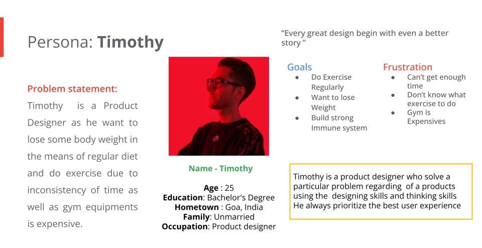
The user personas
Problem & Solution Statement
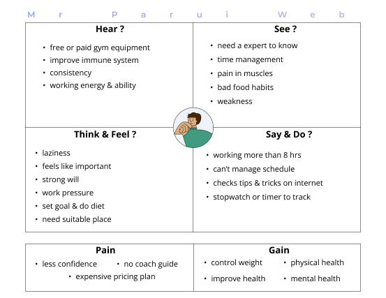
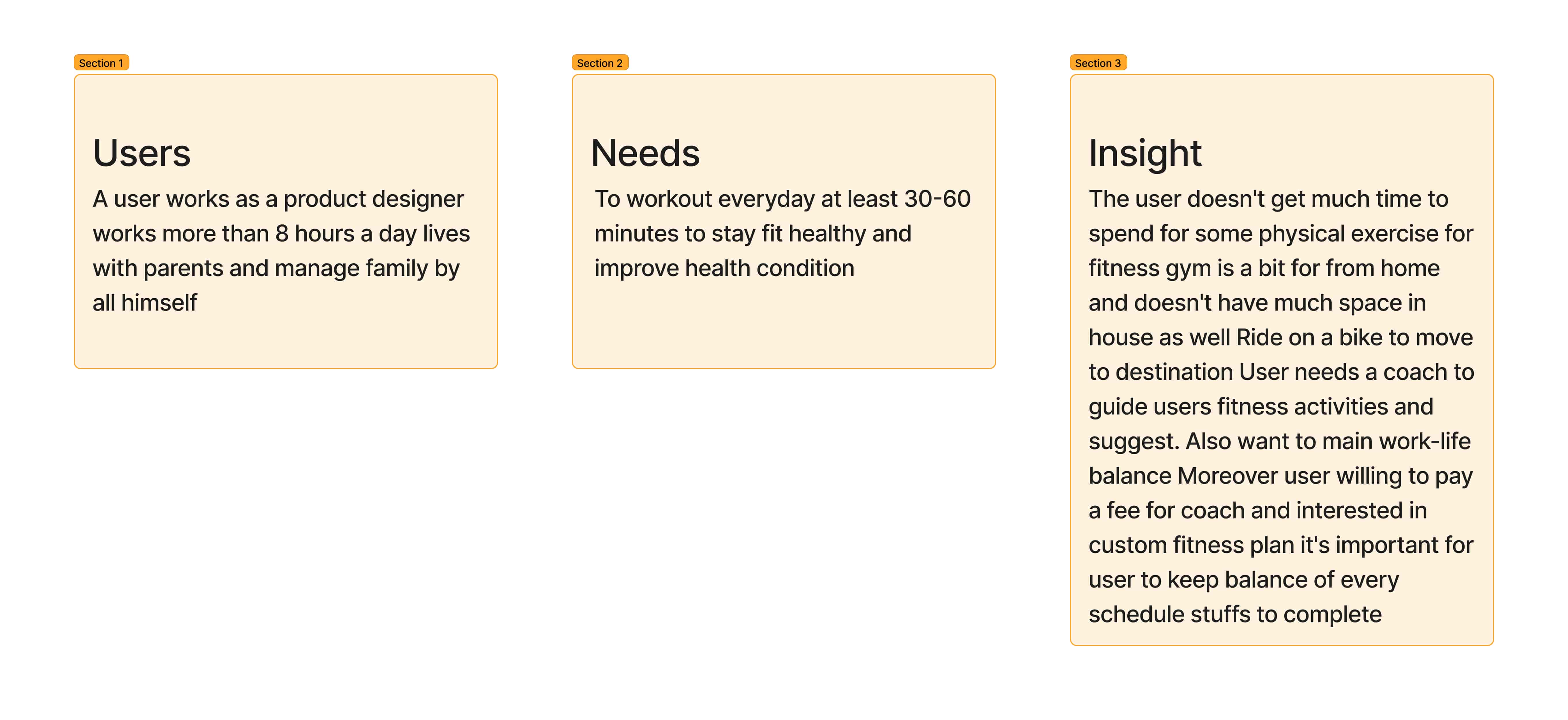
The user research and user persona that was conducted in tandem with the empathy mapping provided valuable insights into the problem at hand. By delving deeper into the data and information that I had collected, I was able to synthesize this data and use a template such as User Need & Insights to develop a comprehensive problem statement. This statement served as the foundation to begin the process of finding a suitable solution that would address the user's needs
My offering solution
Design Thinking is a non-linear process, so it is continuously developed through experimentation, research, and iteration to find the best possible solution.
Users will experience the service through a mobile app. To ensure that the designed digital experience is friendly, usable, desirable, credible, and accessible, I have proposed the following solutions based on user behavior, attitude, lifestyle, and insights from the research:
- Personalized fitness workouts.
- Tracking of fitness.
- A community for encouragement.
- Challenges to form habits.
- A leaderboard to compete in points.
Go through the strategic problem-solving process.
Point of view/problem statement template
Let's jump into the HMW (how might we) and generate as many questions as possible to validate and uncover insights. We're aiming for questions that are numerous and creative, yet focused on providing answers. Here are some ideas I came up with:
- How can we help users make exercise a regular part of their lives?
- How can we help users schedule exercise?
- How can we collaborate with them to create an exercise plan?
- How can we help them track their fitness and health?
- How can we assist them in developing a diet plan for strength?
- How can we connect them with the fitness community?
- How can we guide them in proper fitness and exercise?
- How can we help them stay consistent with fitness?
- How can we offer them a personalized training program?
- How can we make exercise more competitive to motivate users to do more?
Now, let's break down these HMW questions into actionable tasks. We can use these tasks to create a roadmap for our project. Then, let's look into the technical aspects of our project, like the technologies and tools we can use to implement our idea.
Ideation
For the ideation stage, I tried two methods to find the solution: Worst Possible Idea and Challenge Assumptions. Since I was the only player, I went with the worst possible idea. It was kind of fun coming up with ideas that could help come up with a better one. Here are some of the worst possible ideas I had:
- Suggesting the hardest workout challenge
- Telling them they'll lose their account if they don't do the workouts
- Connecting them with fitness-minded people who want to quit junk food and start exercising
I also wrote down some assumptions about the user. This is a great way to come up with answers, especially when you have a short amount of time (like 5-10 minutes). These were some assumptions I had:
- They'd have enough motivation to leave early for exercise
- They struggle to balance work and life with their varied schedule
- They need to buy materials for fitness activities
So then I challenged these assumptions, and turned them into ideas like:
- Making a fixed schedule to do exercise within a limited time
- Challenging friends to join and beat them
- Group exercise with a leaderboard for competition
Using those assumptions, I had a few ideas to help the user. I suggested they:
- Set a fixed schedule to do exercise within a limited time
- Challenge friends to join and beat them
- Group exercise with a leaderboard for competition
These ideas would help the user find a balance between work and life, and still have time for exercise. Then I figured out the best option and finalized the idea.
Information architecture
Before jumping into the sketch, I first need to understand the flow and process of the user journey in order to understand how the user will interact with the task and be interested. This means creating a roadmap to achieve the task successfully, which involves designing an information architecture. This involves looking at the structure of the data being used, the navigation of the user through the task and the design of the user interface. It is important to consider the user journey when designing the information architecture, as it helps to create a streamlined user experience.
i.e - user sitemap
Do paper sketch
I research and collect all the relevant information needed to write a comprehensive paper. This process is necessary for quickly brainstorming ideas and potential solutions that users need to accomplish their goal. The paper may not be the finished product, but it will create the groundwork for further developed, higher quality mockups in the proceeding stages. Doing the research and compiling the data into a paper will make the process more efficient and beneficial for all parties involved.
In the next step, there are low-fi wireframes.
Low fi wireframe
Utilizing a low-fidelity wireframe to create a prototype, synthesize all previously collected data, as well as any additional requirements, and incorporate black and light gray colors and text to define the content for the finalized product design.
This will help to ensure that the design is visually appealing and well-structured, allowing for a smoother development process. Furthermore, the wireframe will enable the user to have an initial overview of the product design, and make it easier to identify any potential issues or areas for improvement. Ultimately, this will lead to a more successful and efficient product design.
High fi wireframe
Final Design & Tasks for users to achieve
During the Visual Design stage, a Product Style Guide and Design System are created for the end product. This allows for analysis of tasks and flows that enable users to achieve their desired goals, such as creating a personalized fitness program. A partial preview of the Style Guide and components used throughout the MVP of the product is available.
For product design, it is essential to be knowledgeable of the components and style guide. Through proper branding and use of components, the product should be easily recognizable and have the ability to scale in the future.
However I use the “Google’s Material You“ theming in the app for better user experience
App Logo Design Process
First and foremost I though that what the logo for "Fit Streak" could potentially look like ? 🤔 So I think and taken a day time to build a app logo from scratch and I’m came out of this idea
After careful consideration, I came out is that the word “Fit” mean to stay physical fit and do exercise so I think that dumbbells as an appropriate representation for the app logo.
then the word “Streak“ is a little bit confusing so after some time I got the idea of use the fire emoji which is commonly associated with maintaining daily streaks on Snapchat with friends that why I take this two of them in to account and then I came out with this idea
here is the main logo for the app
Style guide
In this stage provides a sneak peek into the Style guide and components I used across the final product. These components were carefully selected in order to ensure a consistent look and feel throughout the product. I put a lot of thought into the design elements, such as typography, color, and spacing, to create a cohesive and unified style. I also wanted to make sure that there was a clear understanding of how components should be used and how they could be adapted to any design situation.
By studying the style guide, anyone can quickly learn the basics of creating a unified design language. With a bit of practice, they can create products that are visually pleasing and well organized.
User onboard
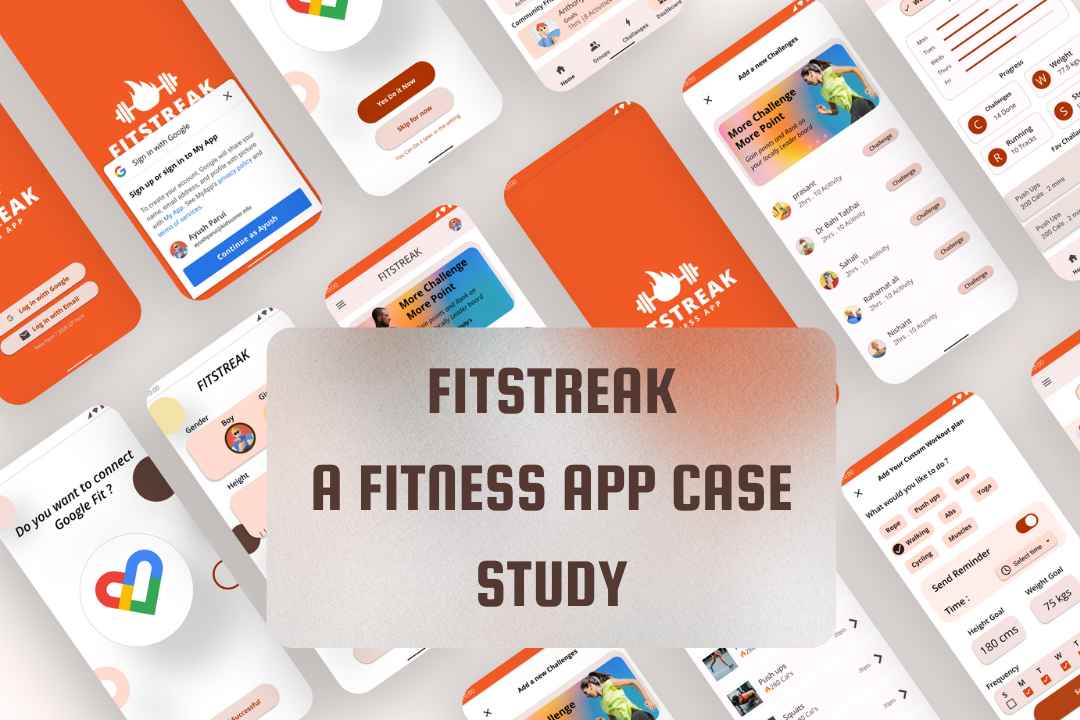
In this stage of the process, users will have to make a conscious decision about their intention and provide accurate information about their body measurements. They will also have the option to customize the notifications they receive to remind them of their daily goals, as well as any additional instructions, such as specific time frames for completing tasks. This customization feature will be key in helping users stay focused, motivated and on track to achieve their goals.
Home fitness lessons and others
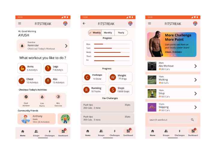
On the home page, users can easily view their upcoming reminders for upcoming polling events, and get a sneak peek into their goals, minutes spent, and calories burned. After that, they will be able to access special workout lessons provided by certified mentors, which they can customize to their own needs and preferences. Moreover, they can even create their own personalized workout routines, with tailored exercises and techniques, to help them reach their fitness goals in the most efficient way possible.
Different challenges & polling
Gamified this task by providing Daily challenges to meet on a daily basis, encouraging users to come together to achieve their goals and make it to the top of the leader board. The daily challenges will give users something to look forward to, as well as a sense of accomplishment when they reach the top. Additionally, a polling system has been implemented within the community so users can work together to reach their goals. This system will provide users with an added level of engagement and motivation to keep striving for success.
Scores and leaderboard
This leader board was designed for gamification, providing users with a way to engage with the app by competing to be on top. It encourages users to challenge each other and meet goals, striving to reach the highest levels of success. This leader board and the ability to challenge friends or other users will be an effective tool for promoting user engagement with the app. By providing users with the opportunity to test their skills against each other and strive to outdo each other, this leader board will make the experience of using the app even more enjoyable.
Dashboard of the user
Users can easily access the dashboard and view data based on a variety of timeframes, including weekly, monthly, yearly, and overall progress, as well as other meaningful insights relating to their fitness journey. Additionally, users can also view a breakdown of their daily activity, allowing them to gain a better understanding of their overall lifestyle and make changes where necessary. This data is also presented in a visually appealing format, making it easy to analyze and interpret. Furthermore, users can also set goals for themselves and track their progress over time, helping to stay motivated and on the right track.
Business objective
A successful product must be both user- and business-centered. To dominate the market, I had to meet the needs and objectives of both users and businesses. This is a B2C Category business, so it seeks to earn a profit and attract investors for further development with new features. The business objectives of this app are:
- Offer payment of as low as ₹199 / exercise lesson to generate profit.
- Challenge friends and family to sign up on the platform.
- Increase user engagement through gamification.
- After bootstrapping, pitch investors for further feature development.
Conclusion
Scope of work
Post-launch usability testing should be done to get opinions and find possible changes. Things like Nutrition, a coach at home, and a workout area should be added. Post-workout meals, rewards for earning points, and turning points into veggies, good food, and exercise gear should be thought about. The product should be made for a bigger group of people soon.
Reflection and learning
The completion of this project was of great personal significance to me; I allocated considerable time and effort to ensure that I comprehensively included data and insights in my work. My aim was to determine why users wish to exercise and the beneficial effects that stem from doing so. To do this, I conducted an intensive analysis of various approaches to discover and offer solutions for users and businesses alike. I devoted hours to studying, researching, interacting, directing, and composing all body copy in order to gain a complete understanding of the project's objectives.
In addition, I spoke with industry professionals to gain their perspective on the matter and used their advice to craft the best possible solution. As a result, I designed a project that enables users and businesses to get the most benefit from exercise.
My Final Words on Case Study
As I’m a Beginner and Enthusiast Designer I am attempting my first case study on a fitness app and writing a blog about my experience. I welcome any recommendations related to design that could help me improve in the future, As a beginner I might make mistake , but I will take a note of them and work towards improving.
During my Google UX Design course, I did not consider anything that could enhance my design thinking. It’s a long time and doing with a discipline and a lots of dedication towards it so that why I think I should writing a blog on this to share my experiences , gain’s and pains.
I hope you have enjoyed reading this article until the end, so I appreciate you to taking the time & efforts for read my article Thank you very much Have a pleasant day 😊
You can also subscribe to my Youtube channel, if you want, to get more fresh content daily.
Follow me on Medium, Twitter, and LinkedIn for more similar insights daily.
Some Links you must Visit
- Google UI UX Design
- Google UX Design : Create a High Fidelity's Prototype in Figma
- Check My Certificate Here
For any Query or Paid collaboration mail me at : contact@paruidev.com




.jpg)


